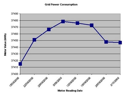
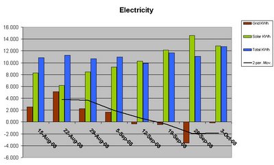
Now for the best part of the week, and everyones favourite, the graphs. The first graph is of the weekly meter readings that I take every Friday evening. It depicts that the meter has spun backward so much over the last month, that we haven’t paid for electricity since about 20th August 2008. A good effort and thankyou Sol! Normally the line would be on a upward trend without the input from self generation. Click on the image to enlarge.  The next graph is of total usage for the property. It is in the same format as previous power graphs with Brown for Grid (100% Green power Wind), Green for clean Solar PV, and Blue for total kWh utilised. The Y-axis represents the daily average usage for the specified week. The black trend line is a 2 point moving average based on grid usage, with a very noticeable downward trend. The date range is the same as the previous graph to make comparison simpler. Click on the image to enlarge.
The Beauty of Renewable Energy
Another fantastic week of energy conservation and production at TGOG’s house! I got so excited this week that I made a movie. Now, because there are not many moving part to a Photovoltaic system, I decided to spice up the movie with a little bit of action and music. Break out the organic popcorn and enjoy!

